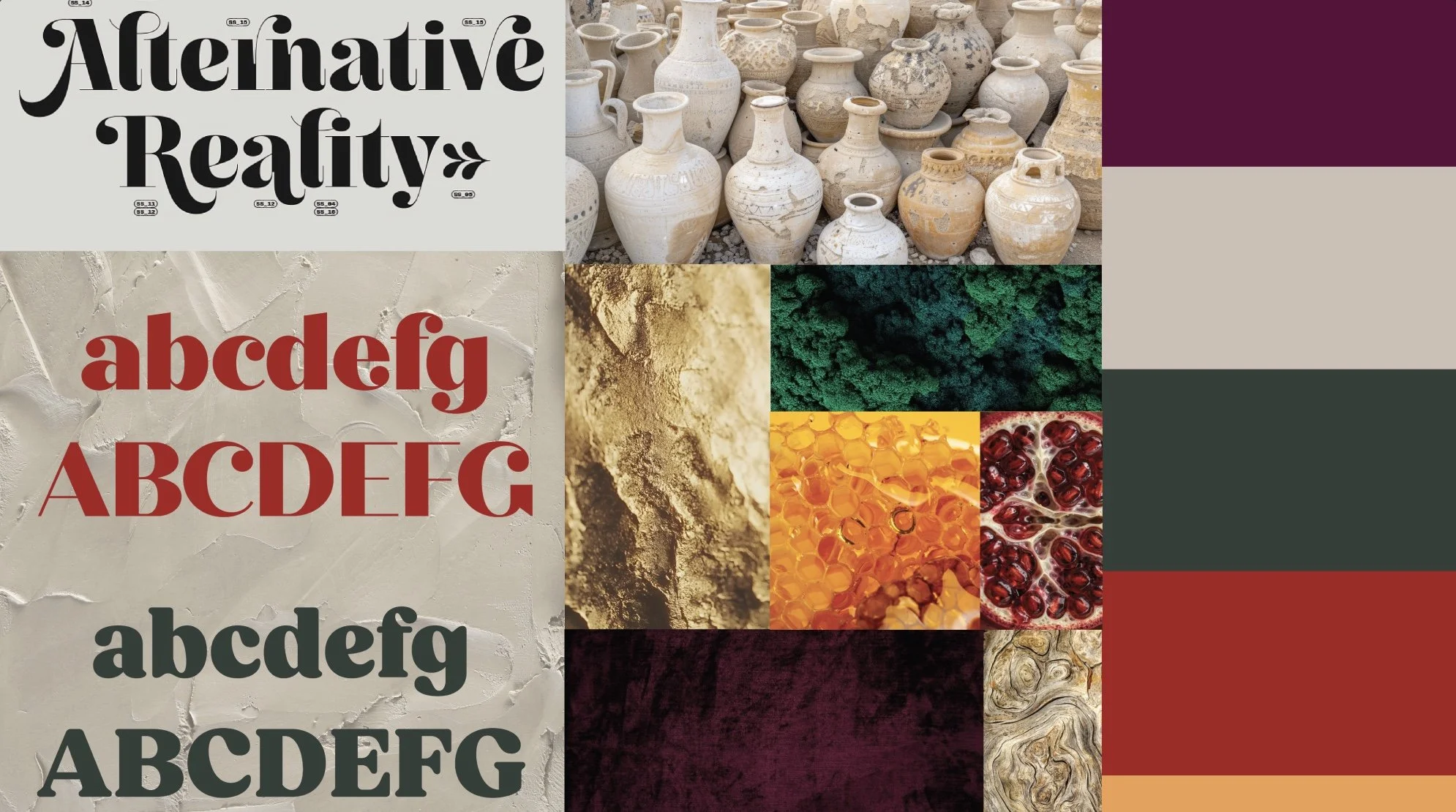
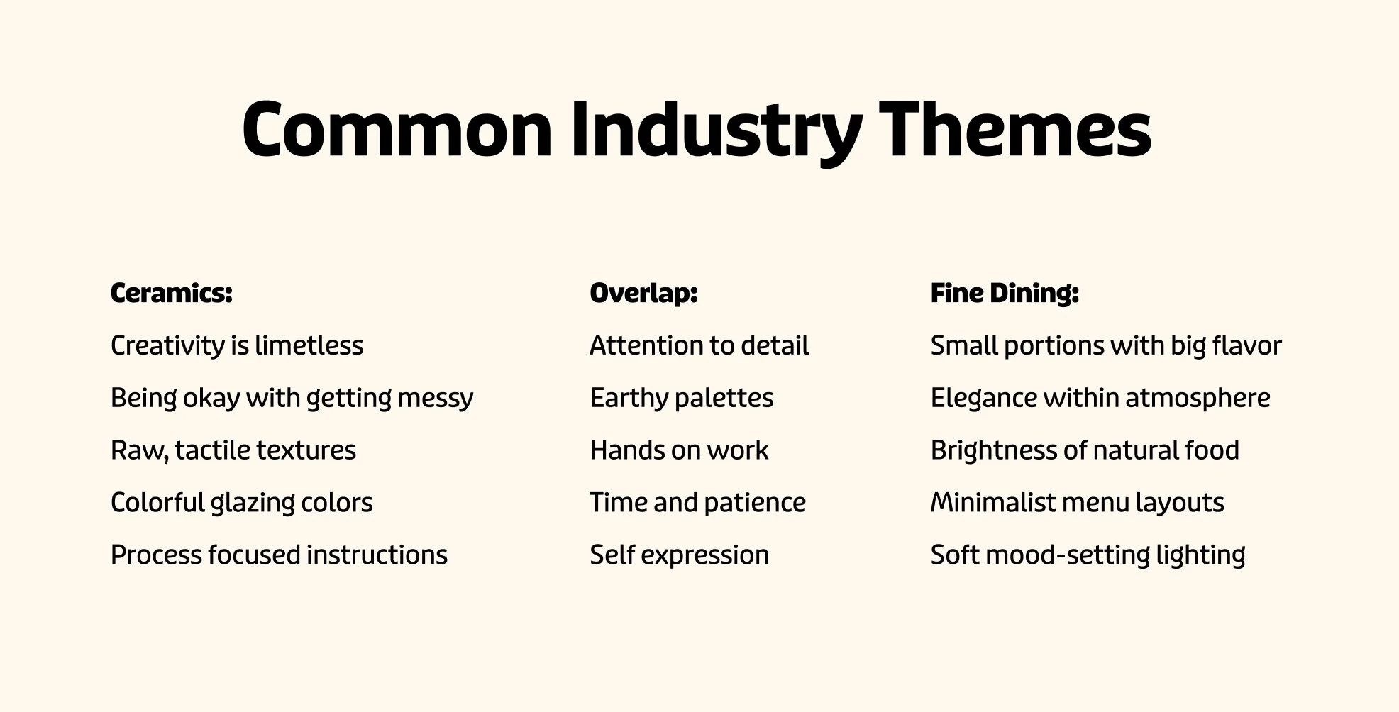
Nibblish? A fictional proper noun that lives between tasting and making. This cross-cultural brand explores the unexpected overlap between fine dining and ceramics, revealing how two contrasting worlds can share a common design language. A visual identity that expresses both quirkiness and luxury; inviting guests to handcraft dinnerware and later return for a gourmet culinary experience served on the very pieces they made. Nibblish is designed for those who enjoy getting their hands muddy just as much as they enjoy elegant meals.
Nibblish
Barilla x AR
Package Re-Design and AR Experience
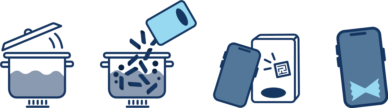
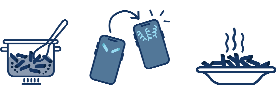
Looking for something to do while your pasta is boiling? No worries, Barilla’s augmented reality experience has what you need. Just follow the directions on the back of your box to enter into a fun pasta cooking experience to pass the time! Share your pictures with your friends and before you know it, your pasta is ready to be drained.
Visual Brand Development, Type Design, UX/UI
Brand Identity
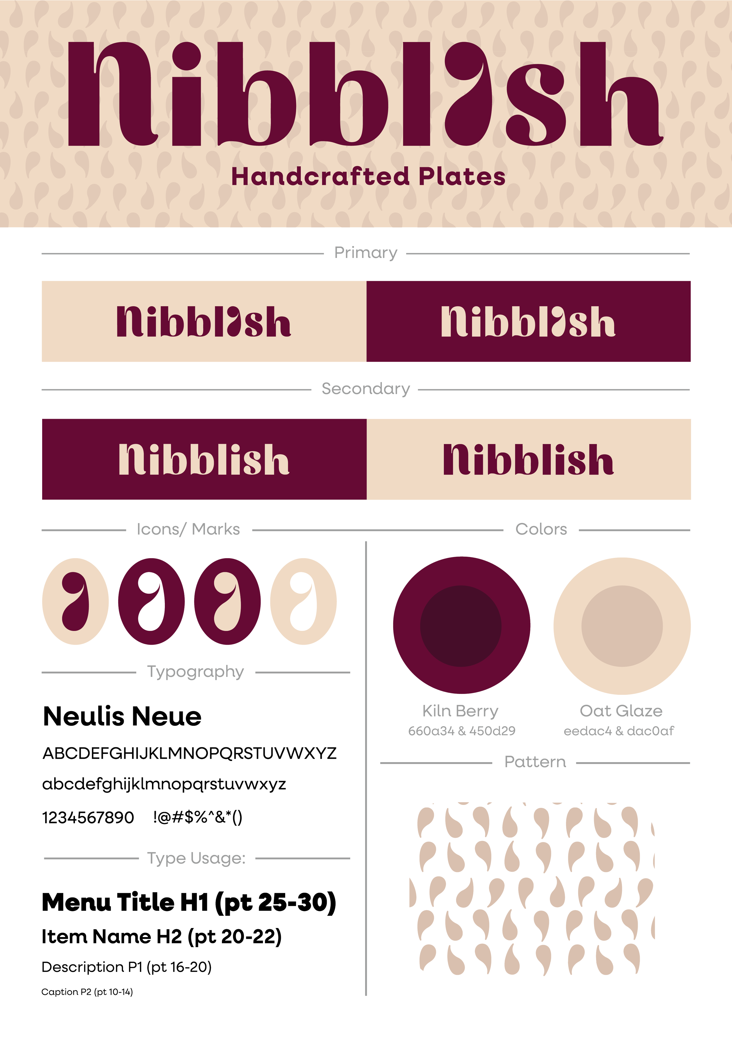
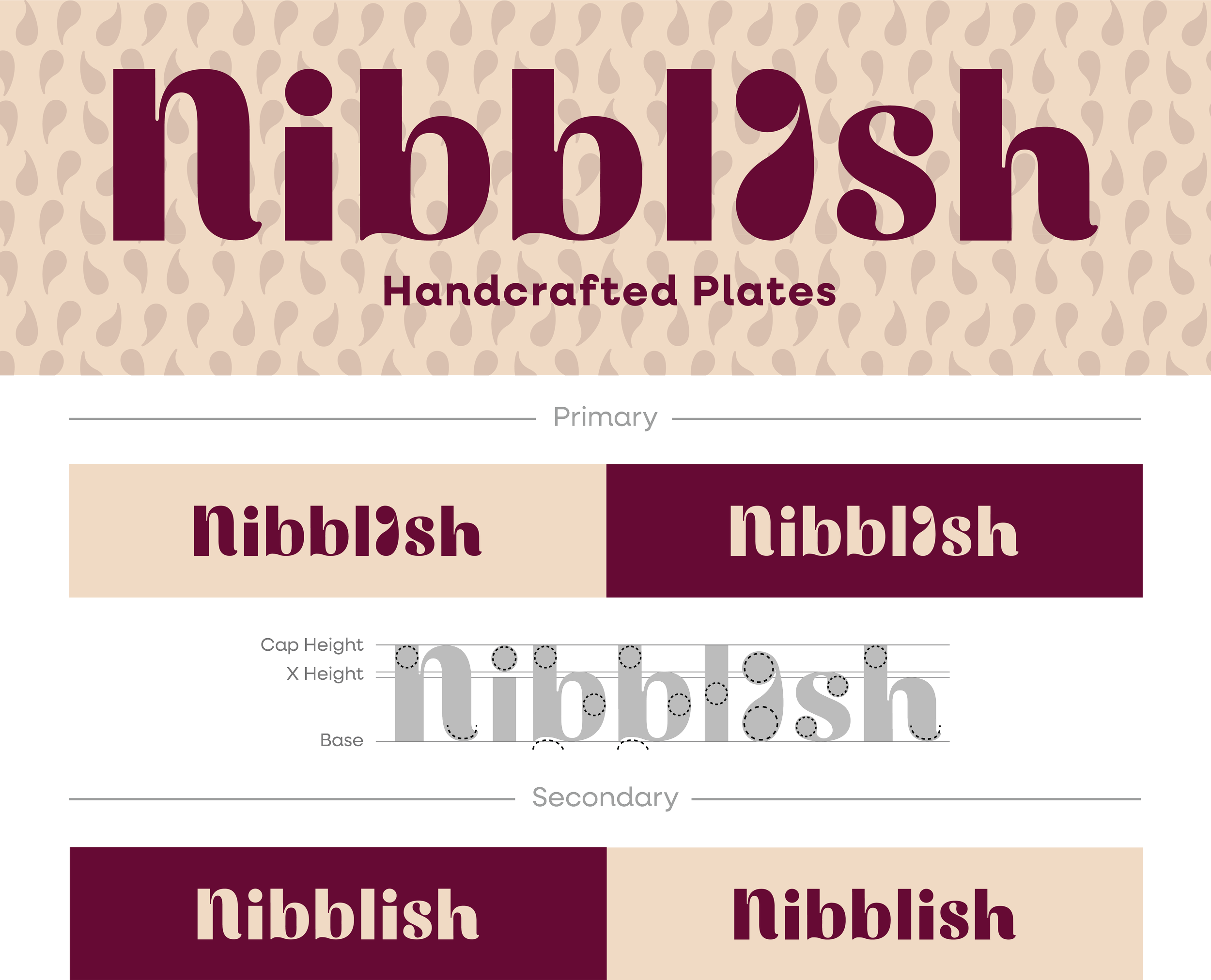
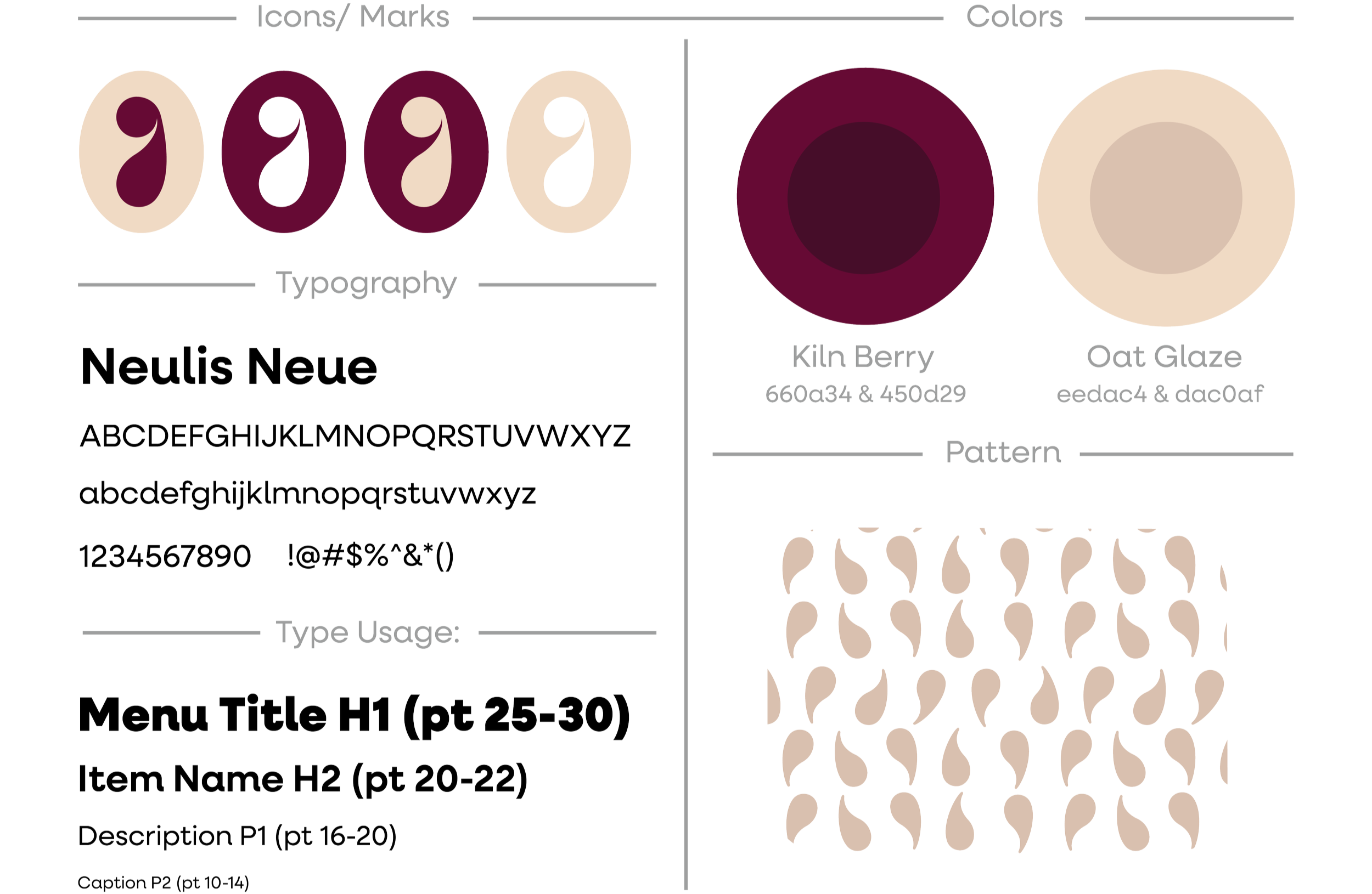
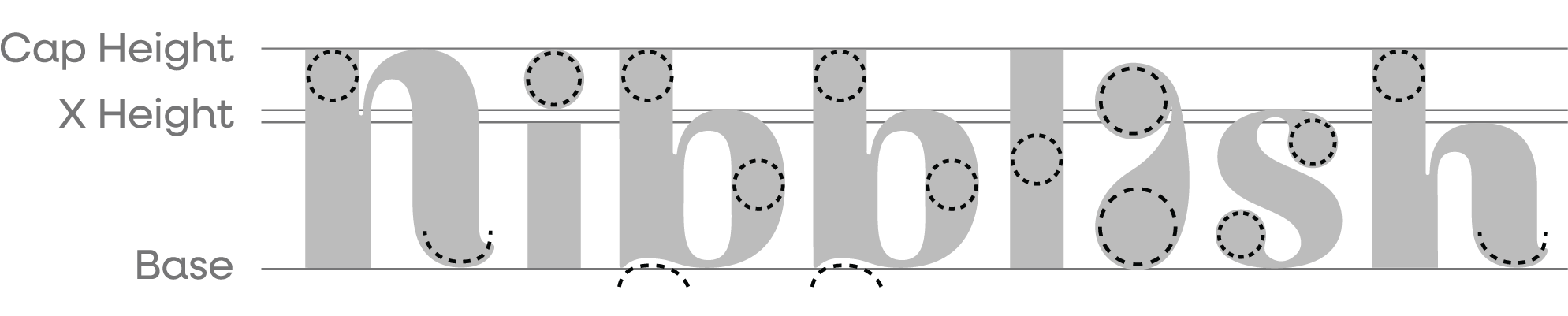
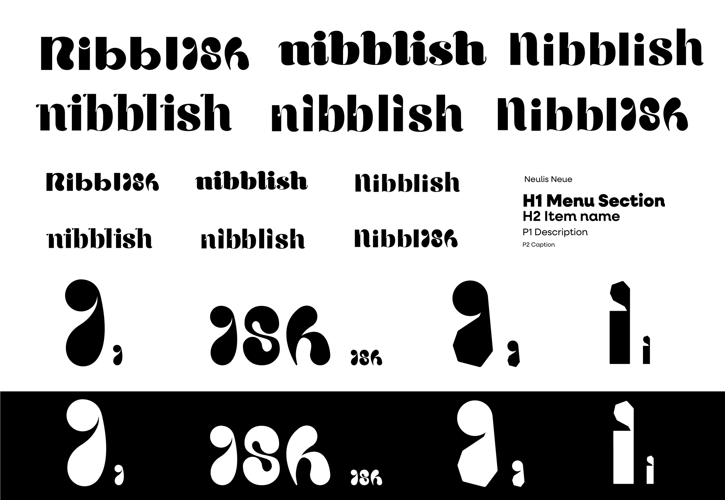
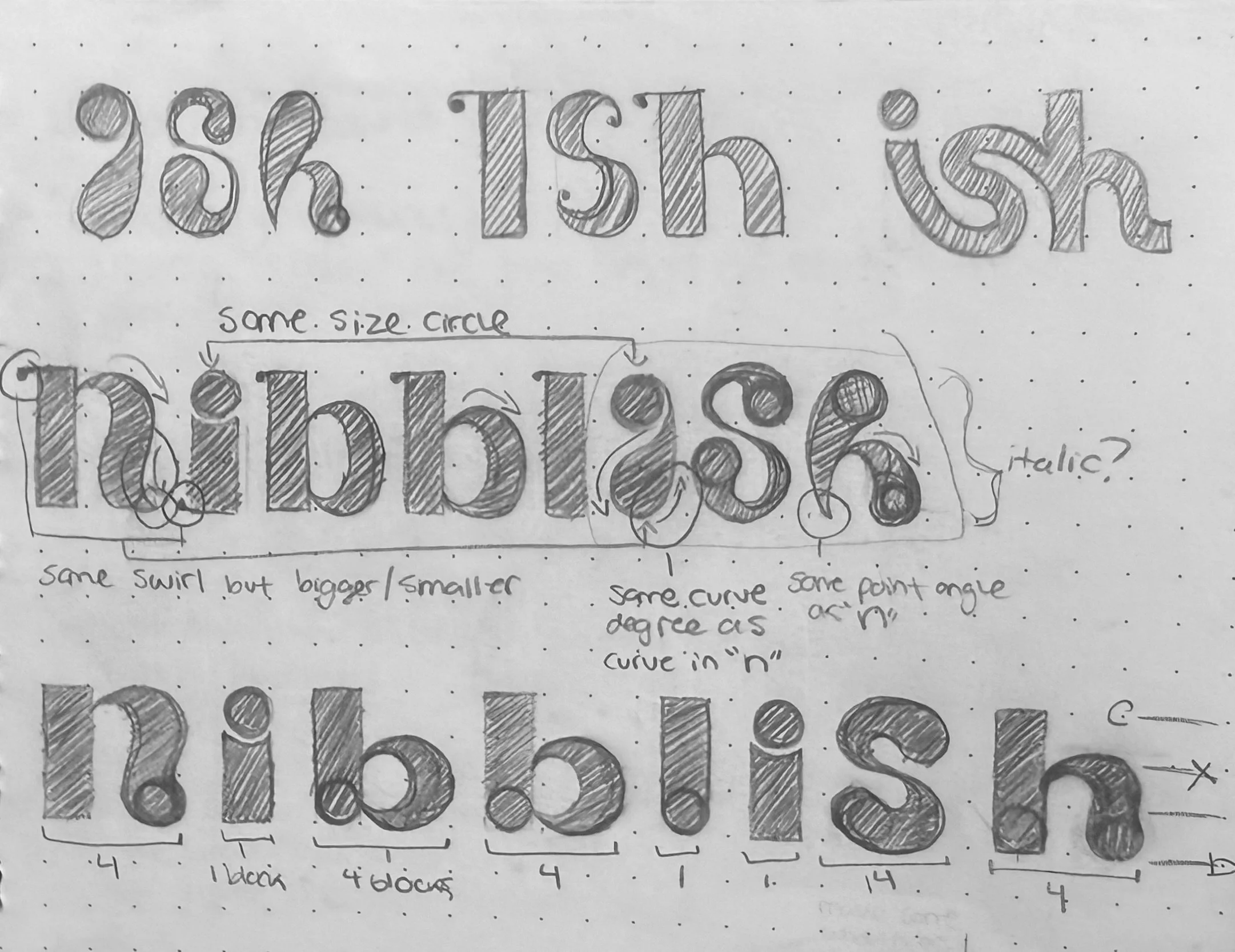
Type anatomy built using consistent curvature and proportions to establish a cohesive letterform system throughout the hand drawn logotype.
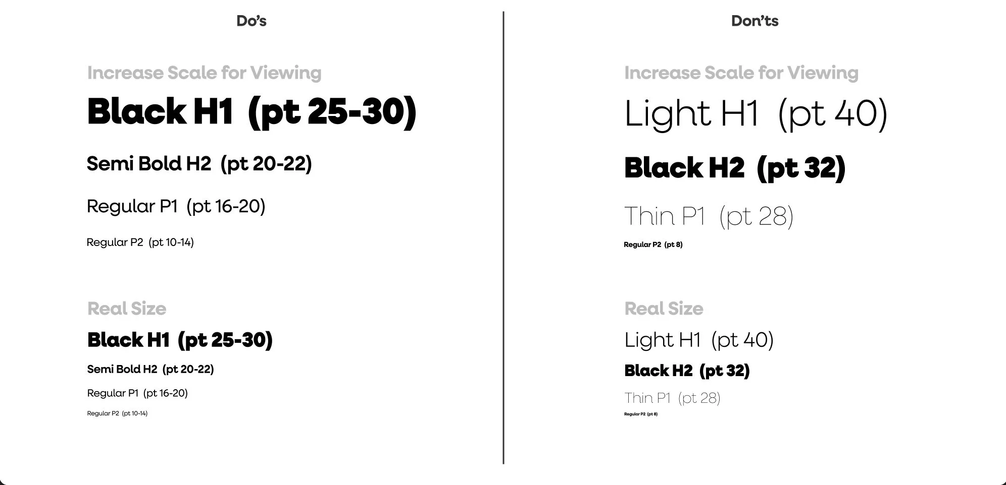
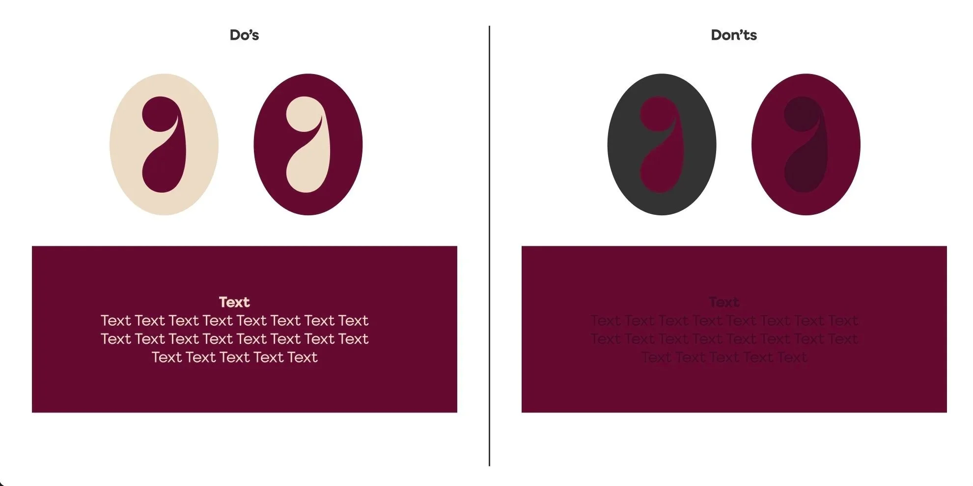
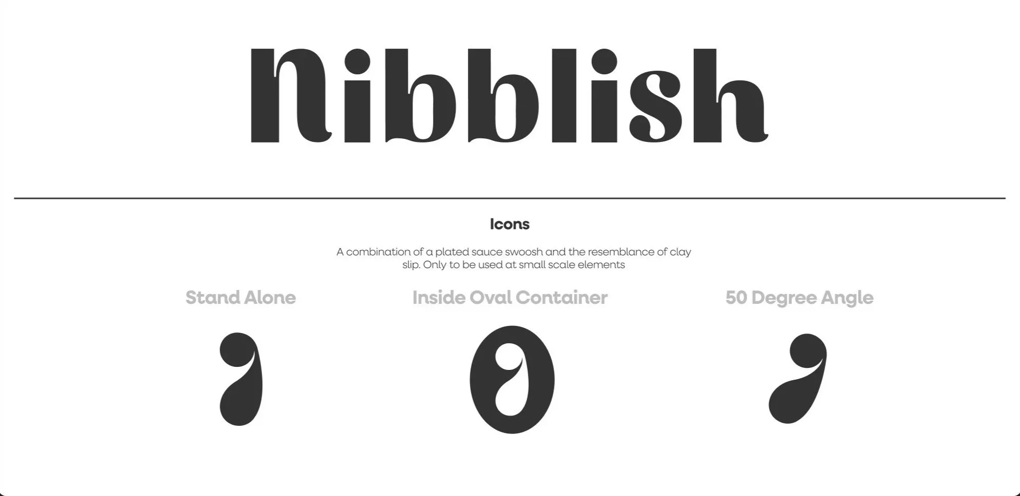
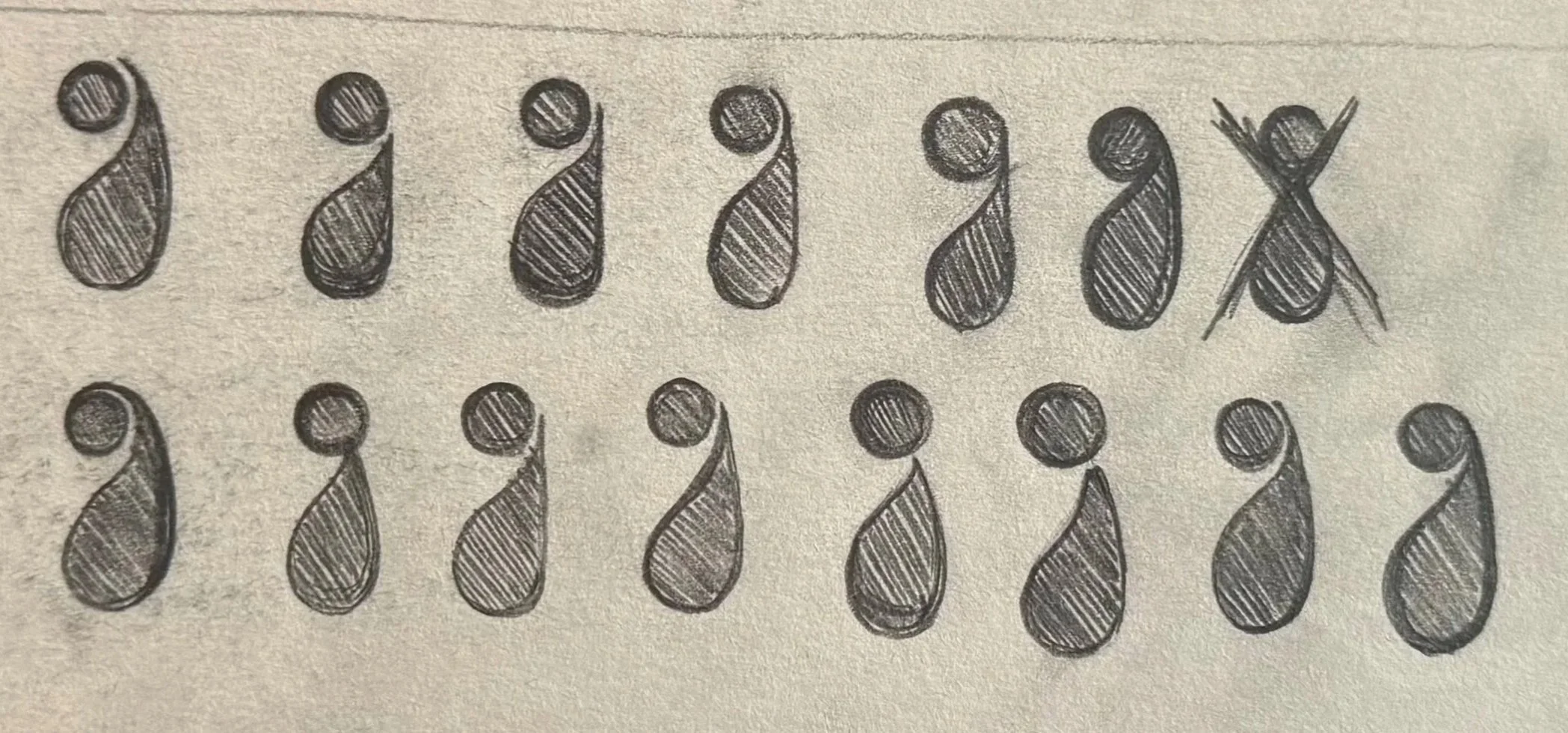
Icon Development

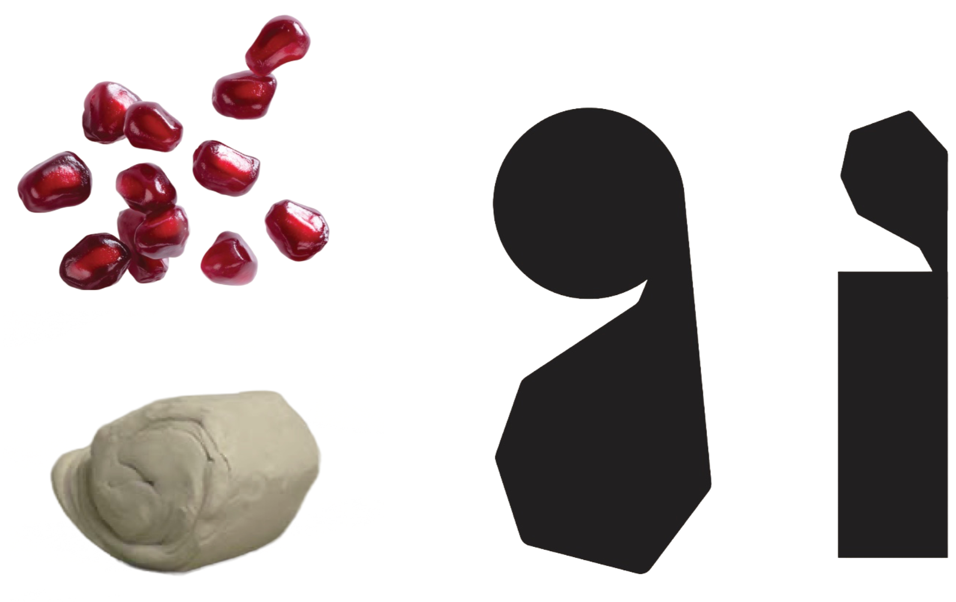
Concept 1: Not Chosen
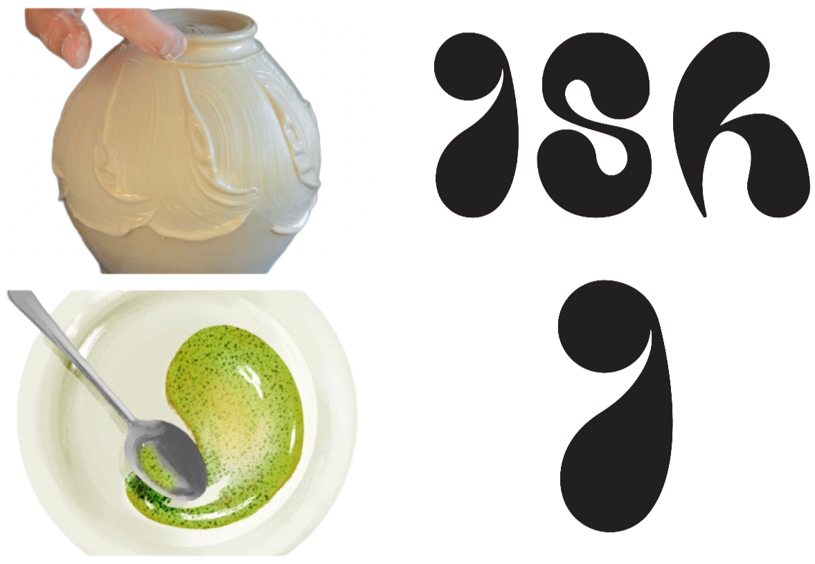
Concept 2: Chosen
The letter “i” based on the formation of pomegranates and the action of wedging clay.
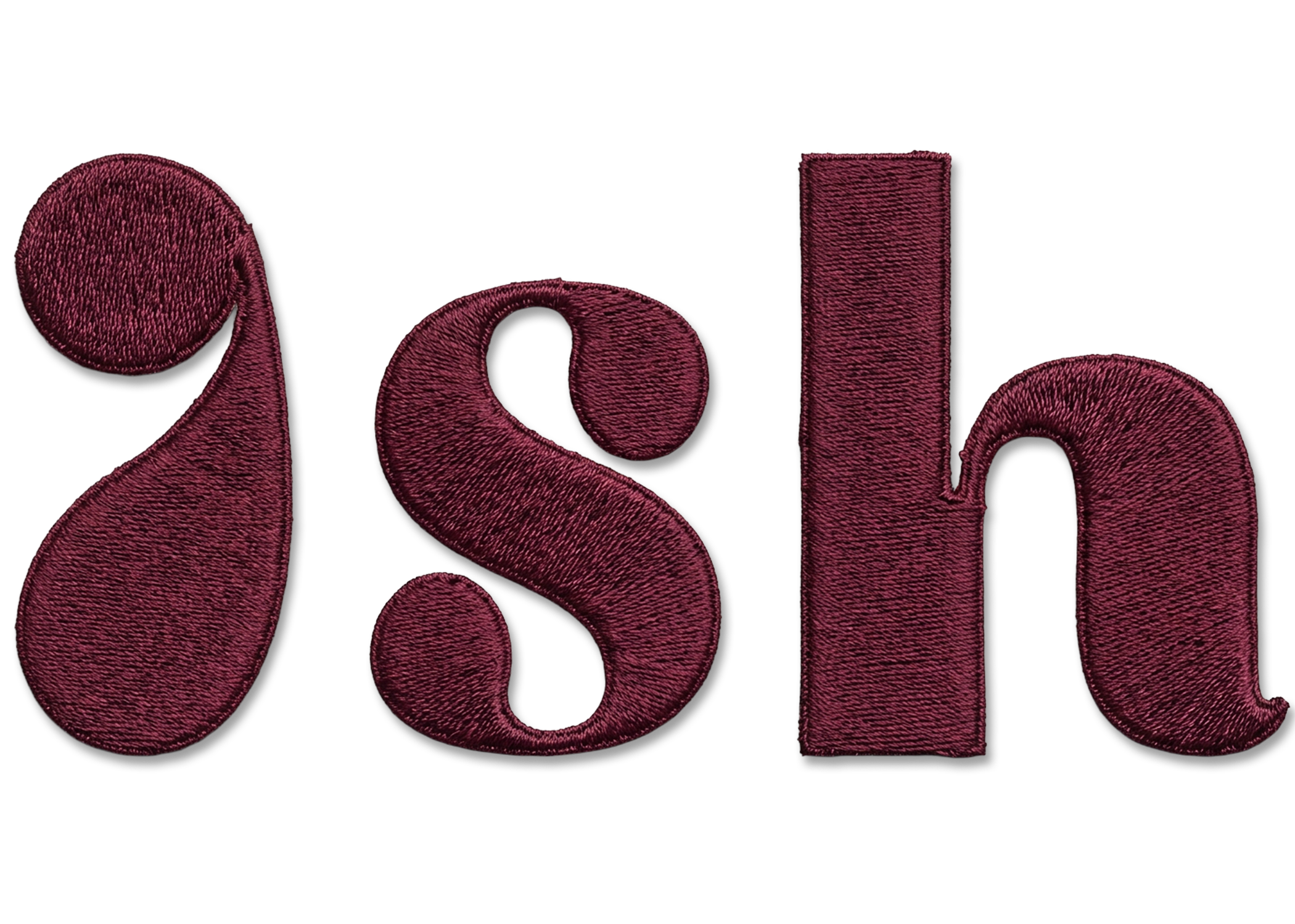
The letter “i” and abbreviation “ish” based on the texture of clay slip and a plated sauce swipe.
Interface Elements
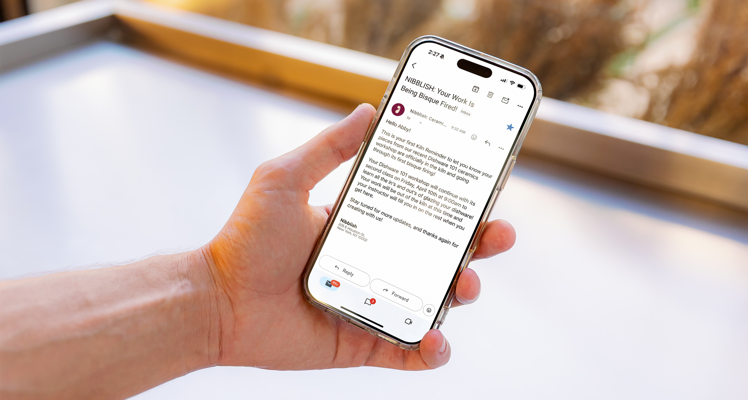
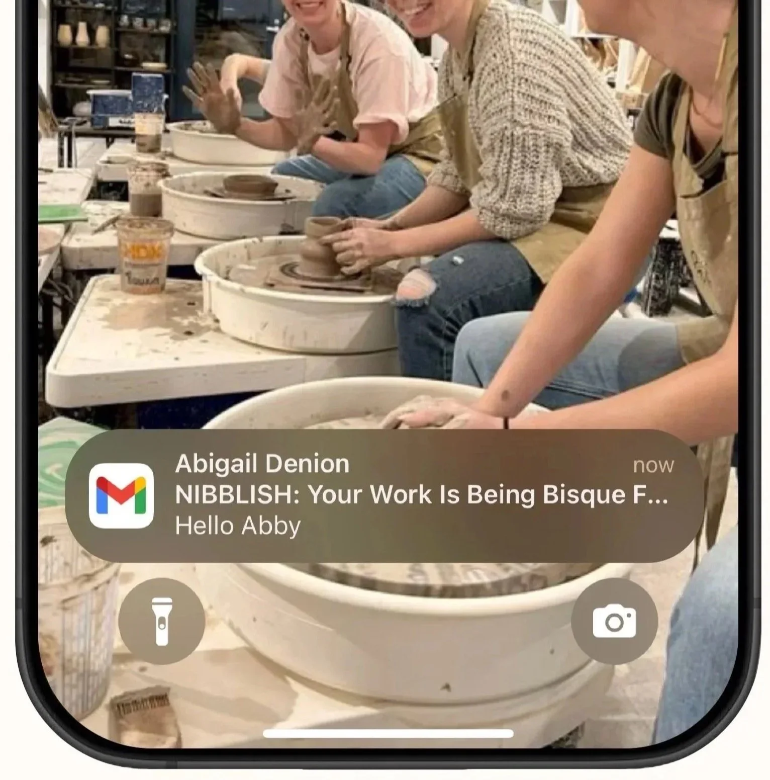

Rather than wondering when your ceramic pieces will be ready, you'll receive an update as soon as your piece completes its kiln firing!
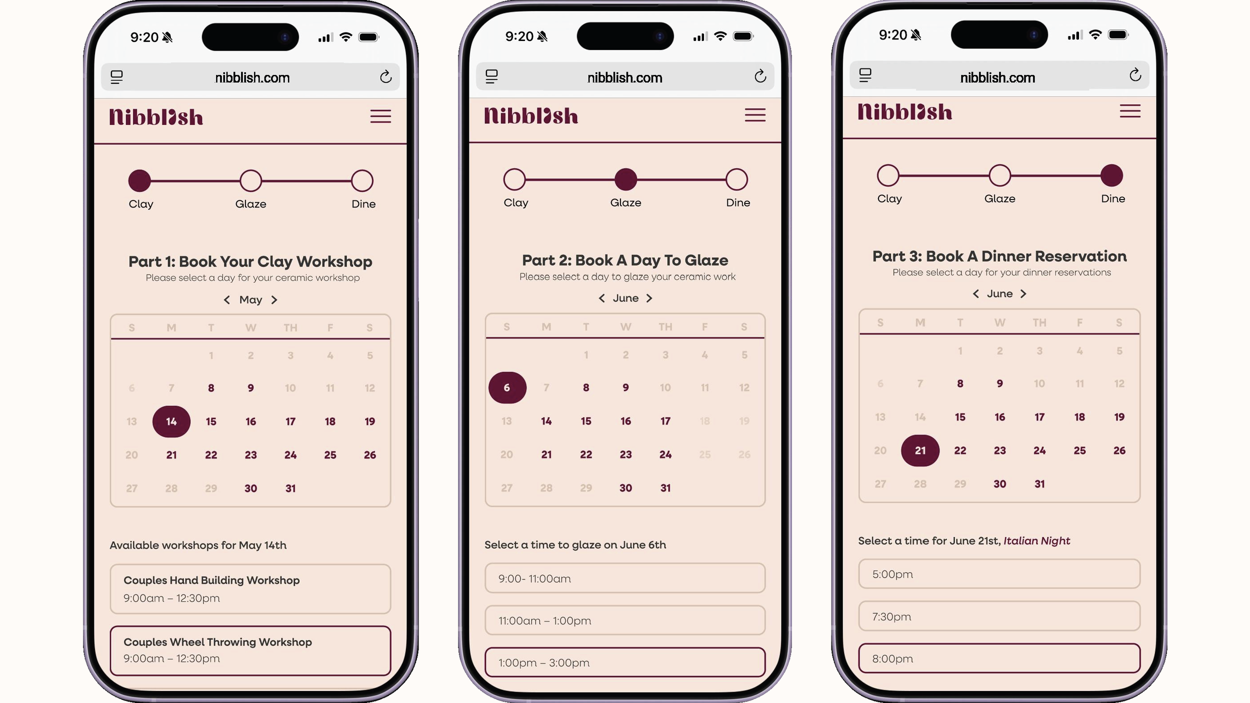
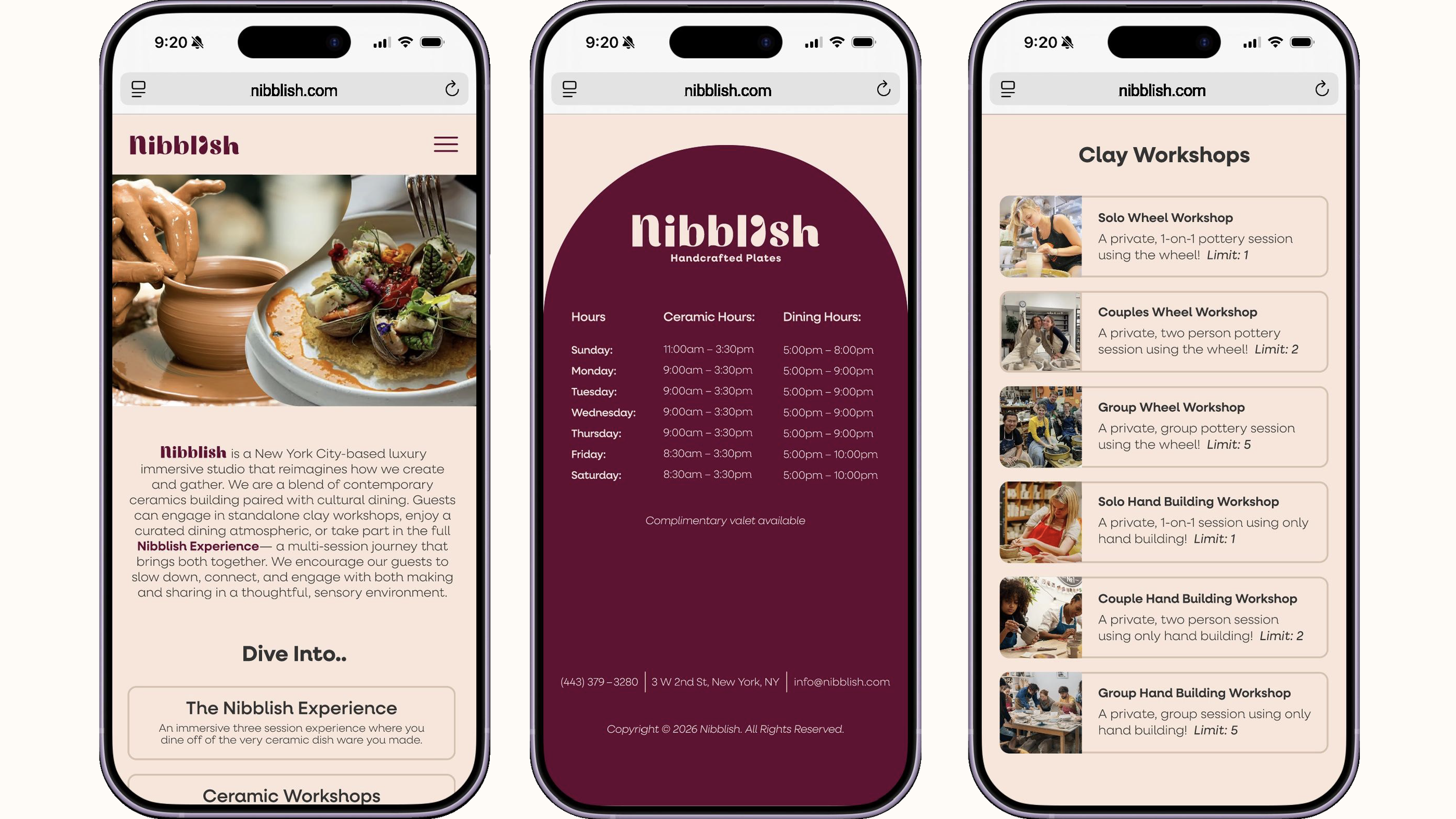
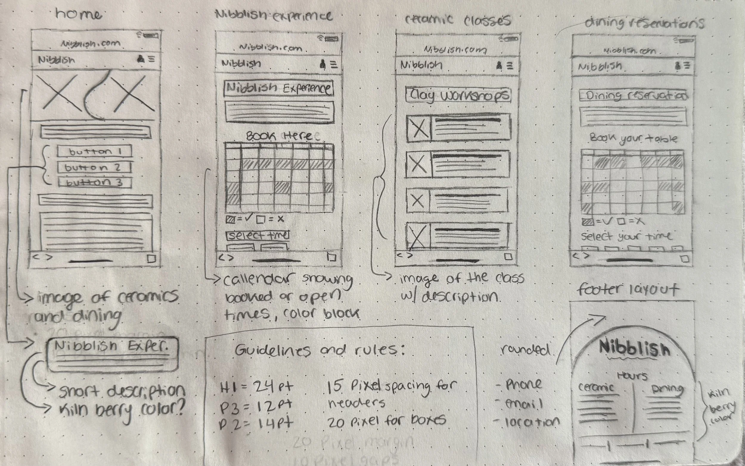
A mobile booking experience designed to guide users through the scheduling process, using familiar visual language and intuitive progress indicators to create a user-centred interaction flow.
Menu Design
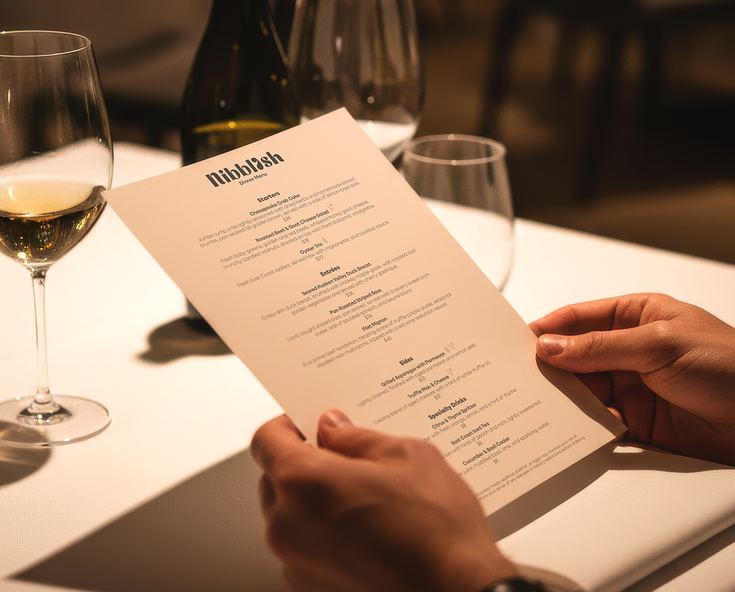
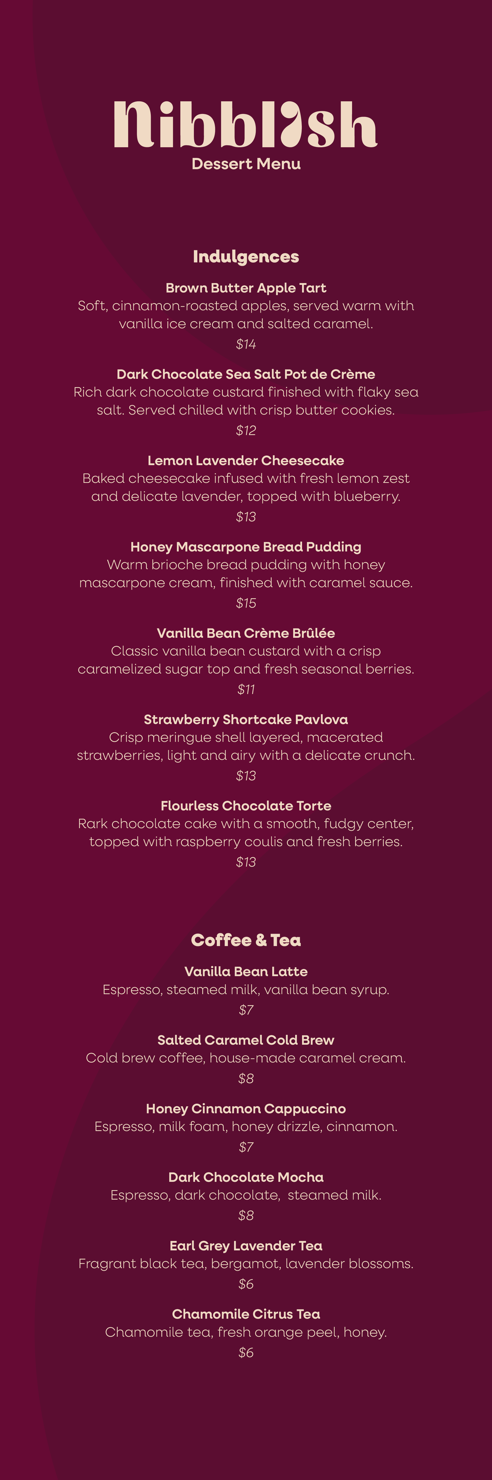
How I Got Here
Packaging
Template
Illustrations